Data Visualization in Epidemiology: Tools and Techniques
Understanding the Importance of Data Visualization
Data visualization is a powerful tool that allows epidemiologists to interpret complex data effectively. By transforming raw data into visual formats like charts and graphs, patterns and trends become much easier to identify. This clarity is crucial in epidemiology, where timely decisions can significantly impact public health outcomes.
Data is the new oil, but like oil, it must be refined to be valuable.
Imagine trying to decipher a long list of numbers without any visual aid—it's overwhelming! Visualizations serve as a map, guiding researchers through intricate datasets and highlighting important insights. Through engaging visuals, stakeholders can grasp the significance of findings at a glance, making discussions more productive.
Related Resource
Ultimately, effective data visualization enhances communication among public health officials, researchers, and the general public. It bridges the gap between complex data and actionable insights, ensuring that everyone involved can make informed decisions based on a clear understanding of the information presented.
Common Tools Used in Epidemiological Data Visualization
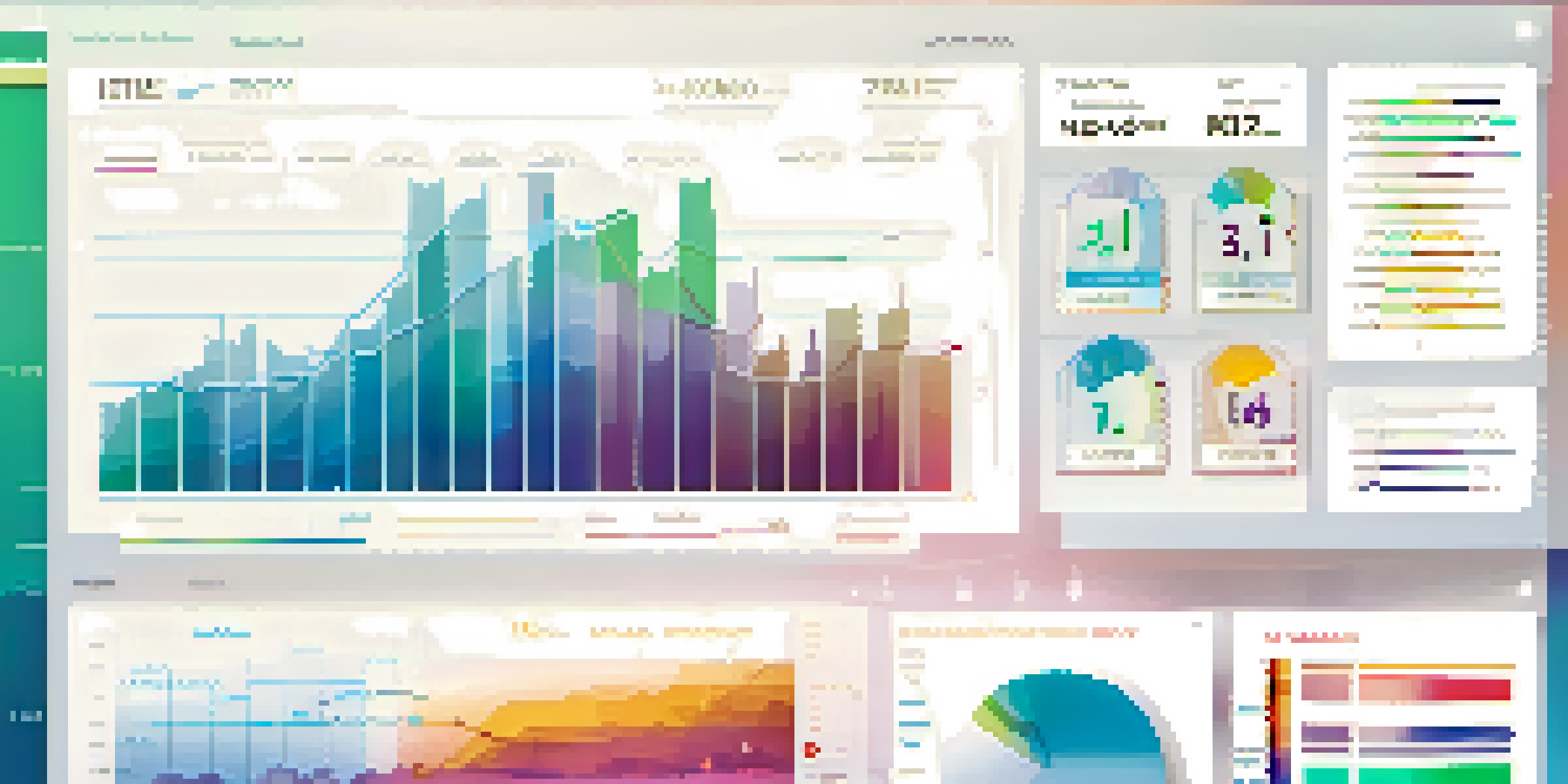
There are several popular tools that epidemiologists use to create impactful visualizations. Software like Tableau and Microsoft Power BI allows users to build interactive dashboards that highlight key metrics. These tools are user-friendly and can handle large datasets, making them ideal for analyzing trends over time.
Another powerful option is R, a programming language specifically designed for statistical computing and graphics. With packages like ggplot2, researchers can create customized visualizations that cater to their specific analytical needs. This flexibility makes R a favorite among data scientists and epidemiologists alike.
Data Visualization Enhances Clarity
Transforming complex data into visual formats helps identify patterns and trends crucial for timely public health decisions.
Lastly, web-based tools like Google Data Studio and Plotly offer accessible platforms for creating and sharing visualizations. These tools enable collaboration among teams and stakeholders, ensuring that everyone can stay on the same page, regardless of their technical background.
Techniques for Effective Data Visualization
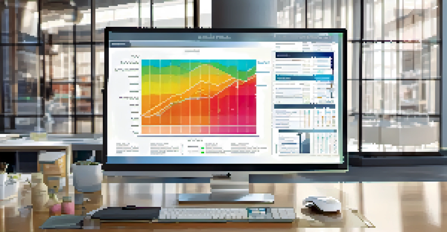
To convey information effectively, certain techniques should be employed when creating visualizations. One key technique is choosing the right type of chart or graph for your data. For instance, line graphs are excellent for showing trends over time, while bar charts are ideal for comparing categories.
The goal is to turn data into information, and information into insight.
Another important technique is maintaining simplicity and clarity in your designs. Avoid cluttering your visualizations with unnecessary elements; instead, focus on what truly matters. Using a clean layout and a limited color palette can help ensure that your audience can quickly interpret the information presented.
Related Resource
Lastly, incorporating interactivity can enhance the user experience. By allowing users to explore data through filters or hover-over details, they can engage more deeply with the content, leading to a better understanding of the data's implications.
Best Practices for Data Presentation in Epidemiology
When presenting data visualizations in epidemiology, adhering to best practices can significantly improve comprehension. One best practice is to provide context for your visuals. Always include titles, labels, and legends to help viewers understand what they are looking at and why it matters.
Another practice is to highlight important findings through annotations or call-outs within your visualizations. This way, key takeaways stand out, guiding your audience's attention to the most relevant information. It’s like putting a spotlight on the main act in a theater performance.
Effective Tools Aid Visualization
Software like Tableau and R empower epidemiologists to create impactful visualizations that facilitate data analysis and communication.
Lastly, always consider your audience when designing visualizations. Tailoring your presentation style to suit the knowledge level and interests of your viewers ensures that the information resonates with them, fostering greater engagement and understanding.
Challenges in Data Visualization for Epidemiology
While data visualization is a powerful tool, it comes with its own set of challenges. One major challenge is the potential for misinterpretation. If a visualization is not designed clearly, viewers may draw incorrect conclusions, highlighting the importance of thoughtful design.
Another challenge lies in the sheer volume of data that epidemiologists work with. Managing and visualizing large datasets can be overwhelming, especially when trying to maintain clarity and accuracy. Employing the right tools and techniques becomes crucial in overcoming this obstacle.
Related Resource
Finally, the rapid pace of data collection and reporting in public health can lead to outdated visualizations. Staying current with the latest data and ensuring that visualizations reflect real-time information is essential for accurate analysis and decision-making.
The Role of Data Visualization in Public Health Communication
Data visualization plays a vital role in communicating public health messages effectively. During health crises, such as pandemics, clear visualizations can help convey critical information quickly to the public. This enables individuals to grasp the situation and take necessary precautions without wading through complex statistics.
Visualizations can also assist policymakers in understanding the implications of data trends. By presenting information visually, they can make data-driven decisions that ultimately lead to better health outcomes for communities. It’s about turning data into a narrative that informs action.
Future Trends Include AI and AR
Emerging technologies like AI and augmented reality are set to revolutionize how epidemiologists analyze and present data.
Moreover, engaging visual content fosters public interest and awareness around health issues. When people can easily visualize the risks and benefits, they are more likely to pay attention and take appropriate actions to protect their health and well-being.
Future Trends in Data Visualization for Epidemiology
As technology continues to evolve, so too will the field of data visualization in epidemiology. Emerging trends, such as the integration of artificial intelligence (AI), promise to enhance the way data is analyzed and presented. AI can help identify patterns that might go unnoticed by the human eye, leading to more insightful visualizations.
Additionally, the use of augmented reality (AR) and virtual reality (VR) may revolutionize how data is experienced. Imagine walking through a 3D model of an outbreak, where you can interact with data points in real-time. This immersive experience could redefine our understanding of public health challenges.
Finally, as data literacy increases among the general population, the demand for intuitive and accessible visualizations will grow. Future tools will likely focus on empowering users to create their own visual content, further democratizing data analysis and fostering a more informed society.